From Mockup to Production — Designing Without Figma Using Claude
How I used Claude Design to generate a complete UI mockup, extracted the design tokens, and implemented the whole thing in Tailwind CSS v4 — no Figma, no shadcn, no overrides.
Most frontend projects start the same way: open Figma, pick a component library, spend three days fighting shadcn overrides, ship something that looks like every other app. I wanted to try something different.
For my car auction platform, I used Claude Design to generate the entire UI from a text description, extracted the design tokens from the output, and built the frontend in Tailwind CSS v4 without touching a single UI library. Here’s how that actually worked.
What Claude Design Does
Claude Design is a separate workspace from Claude chat — it gives you a canvas on the right and a chat interface on the left. You describe what you want, it generates interactive HTML/CSS/JS directly in the canvas, and you iterate from there. The output is self-contained: real CSS variables, real layout, real component structure.
For this project I started with a simple description:
A car auction platform for professional vehicle buyers. Clean, minimal, light theme with subtle borders and neutral grays. Start with the sales list screen — three sale cards with live/upcoming/tomorrow states.
What came back wasn’t a generic template. It had a warm off-white background (#f7f6f3), subtle oklch-based semantic colors for the status badges, Inter Tight as the UI font, and JetBrains Mono for the lot numbers and bid amounts. The design felt considered — not like it had been copy-pasted from a UI kit.
Extracting the Design System
Once I had a mockup I was happy with, I exported the HTML bundle and read through the CSS variables. Claude Design outputs everything as CSS custom properties, which maps directly to Tailwind v4’s @theme block.
The tokens I extracted:
@theme {
  --color-bg: #f7f6f3;
  --color-surface: #ffffff;
  --color-surface-2: #fbfaf7;
  --color-ink: #14130f;
  --color-ink-2: #4a4842;
  --color-ink-3: #8a8780;
  --color-line: #e7e4dc;
  --color-line-2: #efece4;
  --color-green: oklch(0.62 0.13 150);
  --color-green-soft: oklch(0.95 0.04 150);
  --color-amber: oklch(0.72 0.13 75);
  --color-red: oklch(0.58 0.18 25);
  --radius: 6px;
  --radius-lg: 10px;
  --font-sans: 'Inter Tight', ui-sans-serif, system-ui, sans-serif;
  --font-mono: 'JetBrains Mono', ui-monospace, monospace;
}
In Tailwind v4, that’s all you need. bg-bg, text-ink, border-line, text-green, font-mono — the whole design system is now available as utility classes everywhere in the project.
No shadcn
This is the deliberate part. shadcn/ui is a great tool, but it comes with an aesthetic — Radix primitives, Geist or Inter, cold gray palette. Overriding that to match a custom design is friction. You spend time fighting the library instead of building the product.
Without shadcn, every component is just HTML and Tailwind classes. A card is a div with bg-surface border border-line rounded-lg p-5. A badge is a span with bg-green-soft text-green border border-green/30 rounded-full. Nothing to override. Nothing to fight.
The tradeoff is that you write more markup. The benefit is that every component looks exactly the way you designed it.
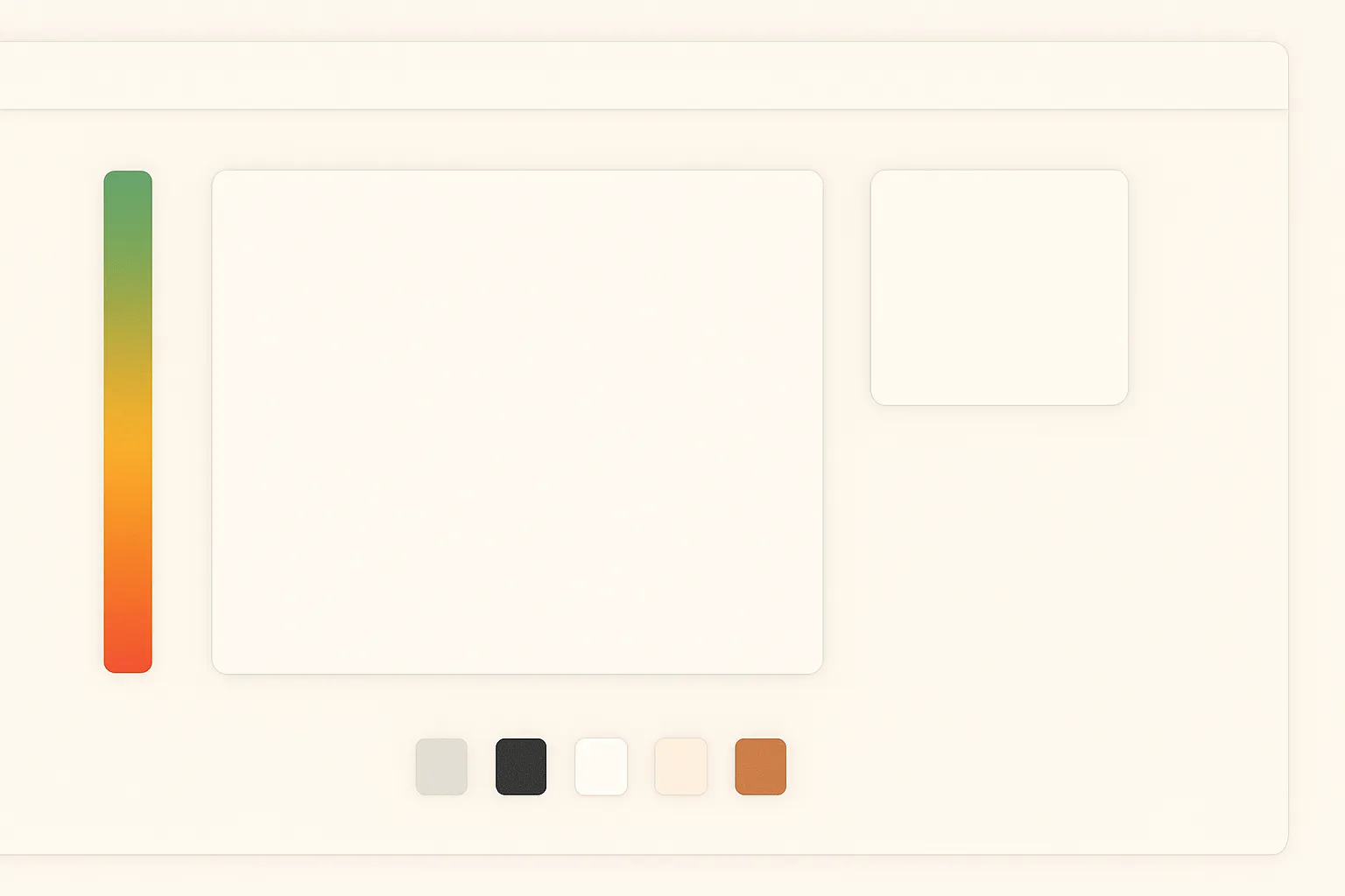
The Hammer Indicator
The most non-standard component on the page is the hammer indicator — a vertical track that descends over 14 seconds of auction silence, transitioning from green to amber to red.
Claude Design gave me the visual reference. The implementation is pure Tailwind and CSS:
// Hammer position comes from Zustand: 0 = top, 1 = bottom
const trackFillHeight = `${Math.round((1 - hammerPosition) * 100)}%`;

const knobColor = phase === 'twice'
  ? 'border-amber'
  : phase === 'sold' || phase === 'unsold'
  ? 'border-red'
: 'border-green';<div className="relative w-2 h-24 rounded-full bg-surface-2 border border-line overflow-hidden">
<div
className="absolute bottom-0 w-full rounded-full transition-all duration-300"
style={{
height: trackFillHeight,
background: 'linear-gradient(to top, oklch(0.58 0.18 25), oklch(0.72 0.13 75), oklch(0.62 0.13 150))'
}}
/>
</div>
<div
className={`absolute left-1/2 -translate-x-1/2 w-4 h-4 rounded-full bg-surface border-2 shadow-sm transition-all duration-300 ${knobColor}`}
style={{ top: `${hammerPosition * 100}%` }}
/>The gradient and the knob position are the only inline styles in the whole component — everything else is tokens. That felt like the right line to draw.
What the Workflow Actually Looks Like
The full pipeline for this project:
- Claude Design — describe the screen, iterate until the layout and visual direction feel right
- Export — read the HTML bundle, extract CSS variables
- Tailwind config — paste tokens into
@theme, load fonts via@fontsource - Build components — implement each component with Tailwind classes, referencing the mockup as a visual spec
- Hand off to Cursor — write a
.cursor/rules/design.mdcfile documenting all the tokens, component patterns, and layout rules so Cursor generates on-spec code
The design rules file is what makes this scale. Once Cursor knows the token names, the border radius values, the font choices, and the component patterns, it generates code that matches the design without constant correction.
When This Works Well
This approach works best when:
- You want a distinctive visual identity, not a generic shadcn app
- You’re building the UI from scratch rather than extending an existing system
- You’re comfortable writing markup — there’s no abstraction layer to hide behind
- You have a clear visual direction to start from
It’s less suitable when you need a large component library fast (data tables, date pickers, comboboxes) or when you’re joining an existing project with an established component system.
The Honest Part
Claude Design doesn’t get everything right on the first pass. The hammer indicator went through several iterations before it felt right. The initial sales card layout was close but the stats row spacing was off. You still need to make judgement calls.
But the starting point is dramatically better than a blank canvas, and the output is yours — not a theme on top of someone else’s component library. That difference matters when you’re trying to build something that looks and feels intentional.